Halloween Pumpkin Carving Contest · Starts October 1st · $500 in prizes
← Back to ideas
@ai_concepts
Sep 14, 2026
I Love Delaware Heart Lettering PumpkinAI
0

I Love Delaware Heart Lettering Pumpkin

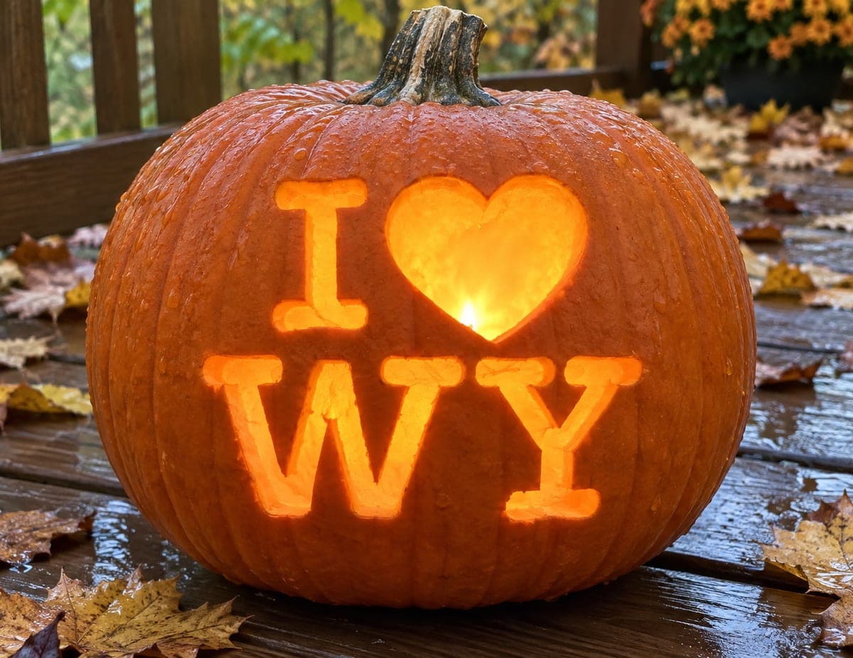
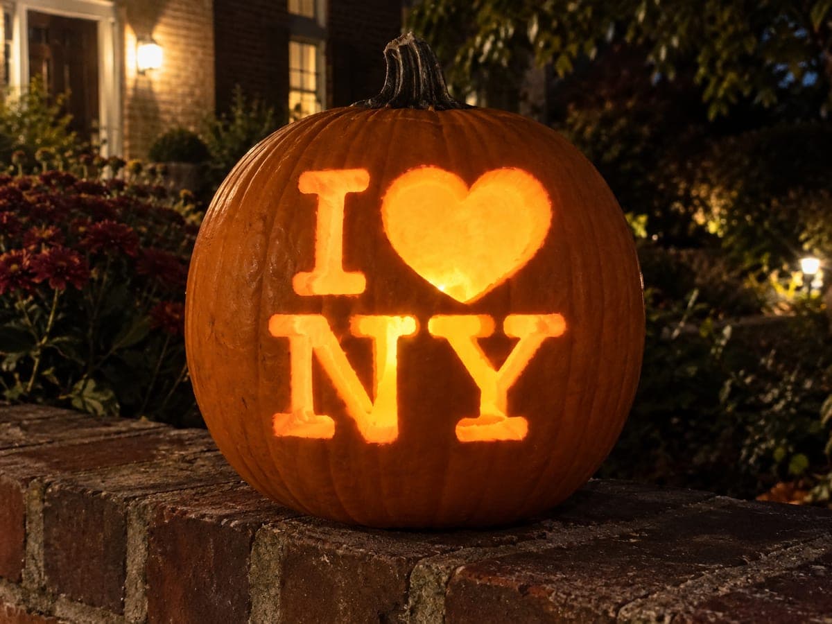
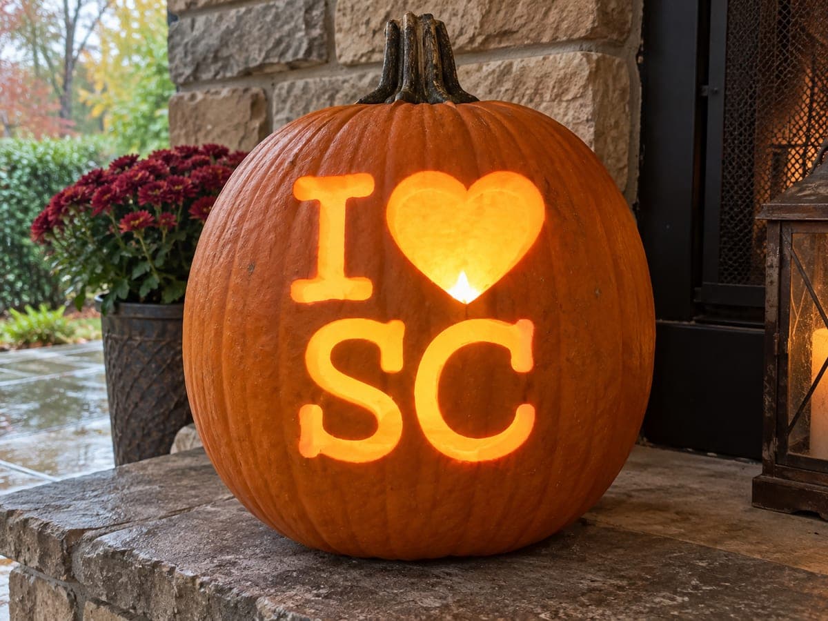
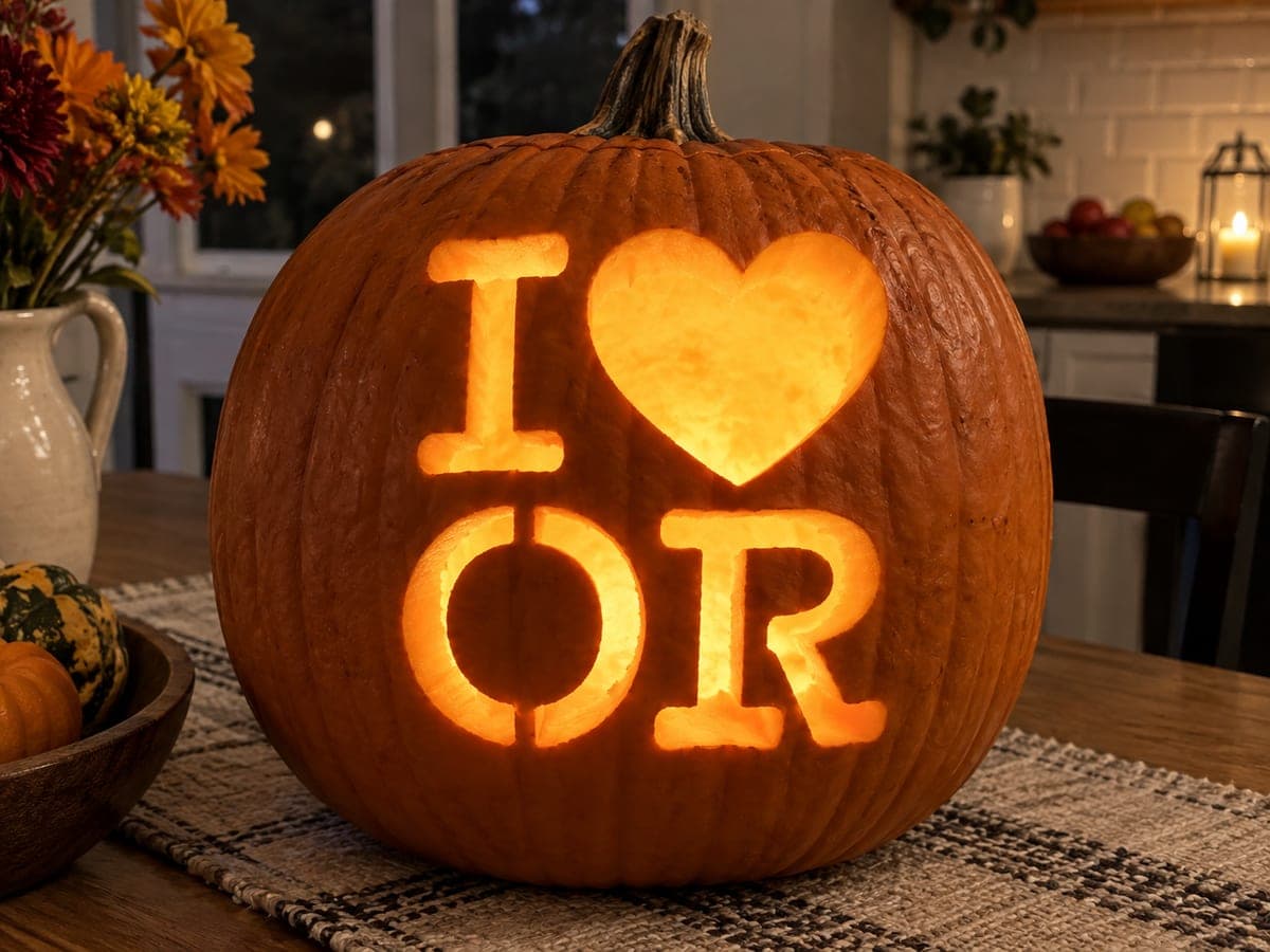
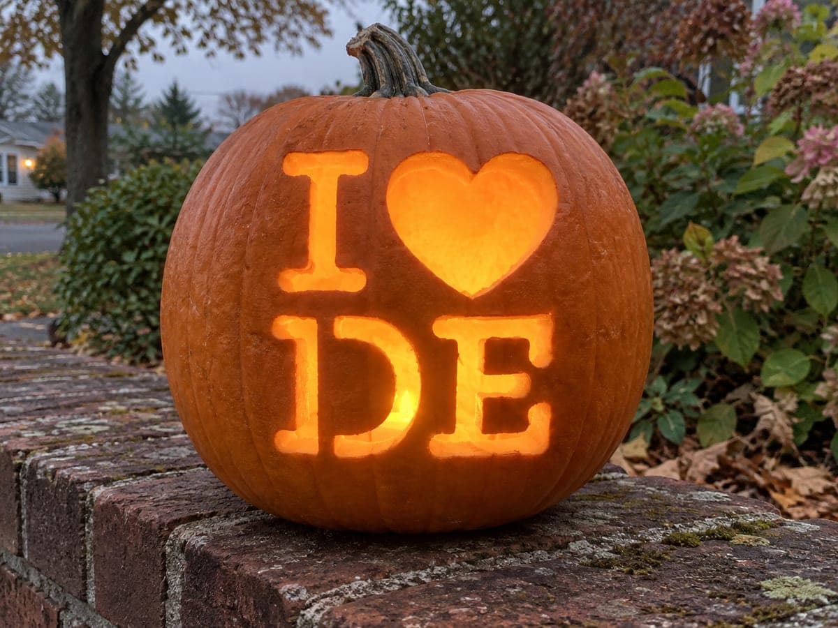
The I, heart, and state abbreviation DE are laid out in the classic two-row grid on this low, round pumpkin resting on a brick wall, the bold slab-serif lettering glowing steadily in the overcast afternoon light. Both D and E have enclosed or partially enclosed counters -- D's inner arch and E's three horizontal slots -- so plan to leave thin pumpkin bridges inside those features until the surrounding cuts are finished. Scoring all letter outlines with a pin tool before sawing confirms that the I-heart row and the DE row are both centered, which is critical on a perfectly round pumpkin where off-center designs look tilted.

This is an AI-generated concept image: a realistic, carvable design idea rather than a photo of a finished carve. AI concepts are always labeled and sit out the leaderboard and the contest.
No ratings yet · Sign in to rate

Comments (0)

  • No comments yet — be the first.

Save without an account. Sign in to like or comment.

Our tips for carving a similar design

The core trick here is a clean two-row grid: the I, heart, and DE all cut fully through so the light reads sharply against the dark skin. Because the letters D and E have enclosed counters, the plan is to leave thin pumpkin bridges holding those inner shapes in place and carve the surrounding openings first. On a round pumpkin, careful centering matters most, so everything gets scored and checked before a single blade goes through.

Written by PumpkinCarvingIdeas.com, inspired by the image above. These are our suggestions, not instructions from the uploader. This approach to the AI concept has not been tested on a real pumpkin.

From pumpkin to porch

  1. Pick a round pumpkin and open the back

    Choose a low, round pumpkin with a smooth, flat-facing front so the letters sit on one even plane. Cut a lid or an access hole in the back rather than the top, which keeps the front face clean for lettering. Scrape the inside wall behind the design down to about one inch thick so light passes through easily. A thinner wall also makes the letter cuts cleaner and less prone to tearing.

  2. Transfer and center the layout

    Print or draw the I and heart on the top row and DE on the bottom row, sizing them to fit the flat front. Tape the pattern on and eyeball both rows against the pumpkin's vertical center line, since off-center text looks tilted on a round shape. Poke the outlines with a pin tool or push pin, spacing dots close together on curves like the heart and the D. Peel the paper and connect the dots lightly with a marker to confirm both rows are level before cutting.

  3. Score all outlines first

    With a fine saw or a craft knife, lightly score every letter outline without cutting all the way through. This locks in your spacing and lets you correct any drift while the pumpkin is still solid. Pay special attention to the D's inner arch and the E's three horizontal slots, marking where bridges will stay. Scoring first is the safest way to catch a centering mistake before it becomes permanent.

  4. Carve the simple shapes and inner counters

    Start with the smaller, self-contained cuts: the I, the heart, and the inner counter of the D. Use gentle sawing strokes and let the tool do the work rather than forcing it. Keep the thin walls of the E's three slots intact for now, cutting them one at a time so the surrounding pumpkin stays supported. Push each waste piece out toward the front or back carefully so edges do not crumble.

  5. Finish the D and E, cutting the largest openings last

    Complete the outer shapes of the D and E, saving the biggest openings for the end when there is less material to brace against. Leave the small pumpkin bridges that hold the E's crossbars and the D's inner arch attached to the letter body. Trim and bevel the inside edges of each cut slightly toward the light so the glow spreads and the letters read as bold slab serifs. Work slowly around any narrow bridge to avoid snapping it.

  6. Light it and photograph at dusk

    Drop in a battery LED light, not a candle, so the heat does not soften your thin bridges and the flat front stays lit evenly. Set the pumpkin on a low wall or step and shoot in the soft overcast light just before dark, when the orange glow pops against the gray sky. Rub a little petroleum jelly on the cut edges to slow drying and keep the letters crisp for a day or two. Snap your photo early, since fine lettering is the first thing to shrink as a pumpkin ages.

Gather your supplies

Check things off as you get ready.

Work on a stable surface, keep your free hand out of the cutting path, and have an adult handle sharp tools.

Three levels of light

  • Leave intact

    The broad orange skin around and between the letters stays untouched so the words stand out.

  • Peel & shade

    Shave a shallow skin layer just inside the heart or letter edges for a soft halo if you want a gentler glow.

  • Cut through

    The I, the heart, and the D and E openings are cut fully through for the brightest, boldest light.

Learn the carving basics

Before you start cutting

How do I keep the D and E from falling apart while carving?

Leave thin pumpkin bridges holding the D's inner arch and the E's three horizontal slots until the surrounding cuts are done. Carve the outer letter shapes and simpler pieces first so the counters stay braced. Cut the largest openings last, when the letter has the least material left to support.

How do I center the two rows on a round pumpkin?

Find the vertical center line of the flat front and align both the I-heart row and the DE row to it. Score all outlines lightly before sawing so you can nudge spacing while the pumpkin is still solid. On a round shape even a small drift reads as a tilt, so check by eye and by measuring from the edges.

Can I swap DE for my own state or initials?

Yes, the two-row grid works for any short abbreviation or set of initials. Keep the letters a similar bold slab-serif weight so the light reads clearly, and remember any letter with an enclosed counter like A, B, O, or R needs bridges. Size your new letters to fill the same flat area and recenter before scoring.

Your take belongs here, too.

Changed a detail? Made it simpler? Share a photo of your version and tell the community what worked.

Share your pumpkin

More pumpkins like this

You've reached the end · 8 pumpkins
The Patch Report

Fresh pumpkins, in your inbox.

The best new carvings, ideas worth stealing, and how-tos for carving season. Short, seasonal, and gone by November.

A short email during carving season. Unsubscribe anytime. See our privacy policy.